The untold story of Boston’s iconic
Citgo sign
Johnathan Wiggs/Globe Staff
Meet the man who designed one of the city’s most-recognizable landmarks.
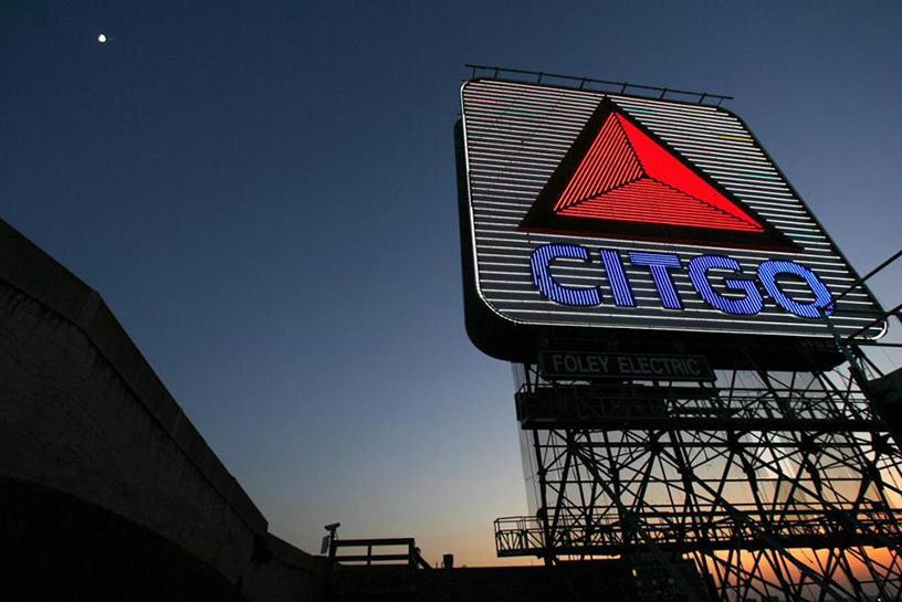
It became a near-instant—and unlikely—icon after it was switched on in December 1965, the enormous oil company logo glowing high above Kenmore Square. The Citgo sign, said to be the largest illuminated sign in New England at nearly 60 feet by 60 feet, has been called this city’s Big Ben or Eiffel Tower. Nationwide television audiences see it whenever a home run sails over Fenway’s Green Monster. And when that happens, older fans might still say “ See-It-Go.” It’s one of our most beloved landmarks (albeit
a still unofficial one), which is quite an accomplishment in
a city where the “ new” State House opened
in 1798.
“ We’ve simply embraced it for its quirkiness,” says William Fowler, a distinguished professor of history at Northeastern University. “ Can you imagine today someone in Boston wanting to put up a monument to an oil company?”
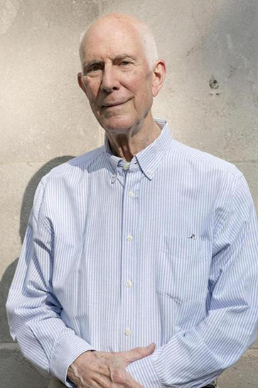
But despite all the adulation, the person most responsible for the sign’s look has labored in relative obscurity. His name is Arthur King, and he led the team at New York-based Lippincott & Margulies tasked with dreaming up the design and the name “ Citgo” more than 50 years ago.
JENNIFER TAYLOR FOR THE BOSTON GLOBE
“This is a landmark for the city. But it is a landmark for me,
too,” says Arthur King, the Citgo sign designer.
“ In those days, industrial designers didn’t get credit for the clients we worked for,” says King, who was born in Pittsfield, admitting nonetheless to being a bit perplexed by his work’s reception. “ I’d like to know myself why Bostonians feel so warmly about it. No one has ever told me why it has this response.”
Well, some say the light show is responsible, and some say that its placement—easily visible from every street in the area—is what does the job. Others say there’s something about its edgy modernity that just pops amid Boston’s historic monuments and cobblestones. “ It doesn’t have the status of the Bunker Hill Monument. It hardly celebrates a great era or accomplishment, but it characterizes Boston,” Fowler says. “ We’re defiant—that’s why the Revolution started here.”
There’s also something powerful about the marriage of design and site, says Milton Glaser, himself an icon among designers: “ I (heart) NY” is his work. “ The framing of the triangle in white is what accounts for its impact,” Glaser says. “ If that entire [white background] was filled with a color, the red triangle would disappear into the mass of other rectangles” formed by the nearby buildings and their windows. “ The two white patches on either side of the triangle are like a magnet to the eye because there’s no other place for the eye to rest in that entire plaza and all the buildings surrounding it.”
The predecessor to the Citgo sign didn’t have that effect. It had stood in the same place as today’s sign, atop the divisional headquarters of Cities Service, since 1940. The old sign, like the old logo, was big and white, with lettering and a border in dark green. It worked when the Oklahoma-based company was a provider of municipal utility services, but not as it evolved into a straightforward oil refiner and retailer. So in the early 1960s the companyhired Lippincott & Margulies, a pioneer in the field of corporate branding, to design something new.
With their marching orders, King and his colleagues embarked on a roughly 15-month design process. On a road trip through several states, they visited about 30 of Cities Service’s gas stations, taking some 2,500 photographs along the way. “ As you went down the road, you could not see the old Cities Service sign. It was in green outlined on white, weak graphically, and often lost in the foliage,” King recalls. “ The sign needed more energy, which is the business they’re in.”
The old logo had featured a simple triangle outline as a design element, and King saw potential there. “ I built on that,” he says. “ It was a bridge from the old to the new.” The shape of the new design—a three-part triangle, set against a square background—came to King almost instantly. “ Sometimes you struggle to find one solution, sometimes you have three alternatives and you can’t make up your mind,” he says.
“ In this case, it was so clear for me.” He also specified three shades of red to give the triangle its pyramidal, raised look. “ I try to put something in my logos that are 3-D and dynamic,” he says. King and his colleagues even tested the colors, using formal focus groups as well as snagging passersby in what were called mall intercepts. “ What amazes me is the rigor behind the projects of that era,” says Connie Birdsall, creative director at Lippincott, as the creative consultancy is now known. “ They tested everything, trying to understand how to make companies stand out in the marketplace in the most effective way.”
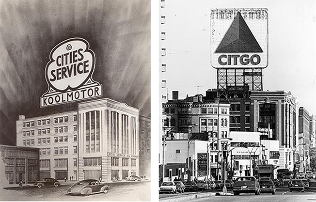
ILLUSTRATION/GLOBE (LEFT); CITGO SIGN/GLOBE FILES (RIGHT)
The Citgo sign’s predecessor (seen in an illustration above left) had stood since 1940 atop what was the divisional headquarters of Cities Service; the Citgo sign (above right) as it looked in 1994.
But perhaps the most ambitious process involved the name. “ Cities Service had too many letters for a sign and no longer described the company or what the company wanted to be,” King recalls. The task of finding a new one fell not to him, though, but to a computer. The machine was programmed to generate options that evoked Cities Service, were short, and didn’t suggest a swear word or pejorative term in any language. The computer spat out some 80,000 results.
After about two months of work winnowing the list, it came down to two finalists: Citco and Citgo. Then lawyers for New York-based financial firm CIT made a fuss about Citco, and the choice was easy.
The rebranding process from Cities Service to Citgo, requiring everything from new road signs to service station uniforms, ended up costing the company $20 million, the estimated equivalent of more than $150 million today. But the payoff was immediate. Sales at Citgo gas stations in 1965 jumped at twice the rate as the gasoline industry as a whole. And the design, of course, is still in place at some 6,000 Citgo stations around the country.
Birdsall attributes the design’s longevity to its simple shape and the spare, unadorned font chosen by King. “ They paired the quirky Citgo typeface with a simple, dimensional shape,” she says. “ Whenever you can do something simple like that, without the embellishments, it stays effective and stands the test of time.” (Birdsall should know—Lippincott also came up with the Campbell’s soup can label, the Coca-Cola ribbon, and other designs that remain fundamentally unchanged today.)
In the decades to come, the sign would weather its share of storms, including at least five hurricanes. It’s been pockmarked with bullet holes and escaped a plan to demolish it in the early ’80s after being turned off for several years as an energy-saving gesture. The outcry was so loud that Citgo reversed course. “ We had no idea it would receive such a response,” a company spokesman said. “ Now we know how much people in Boston love that sign.” In August 1983, Citgo relit the sign to the sounds of “ You Light Up My Life” as more than 750 cheering spectators looked on.
The sign survived Citgo’s subsequent sale to Venezuela’s state-owned oil company in the Reagan era. (“ We might as well have had a statue of Fidel Castro!” Fowler says, although he’s quick to point out that Citgo supports Joe Kennedy’s local Citizens Energy heating-oil charity.)
And it even survived technological makeovers that replaced its neon tubeswith 240,000 LEDs in 2005 and 218,000 in 2010. The second one saved $18,000 in electricity costs annually, though the lighting drew complaints that the brightness and contrast don’t quite match the neon original.
But now the sign faces perhaps its greatest challenge. The owner of the $20 million building on which it stands, Boston University, put it and eight other nearby structures up for sale in January, calling the sign’s ultimate fate into question.
The impending sale has galvanized the public just as the sign’s impending demolition did in 1982, when it was saved by a last-minute cease-and-desist order obtained by the Boston Landmarks Commission. Although that outcry did not lead to the sign being designated an official landmark, this time may be different. A petition pending before the commissionseeks to protect the sign as a true landmark, a move that could reduce a prospective buyer’s development options and thus cut the price BU might receive. Still, BU officials have said they are encouraging potential buyers to factor the sign into their projects.
Arthur King, now an independent design consultant in New York City, is hoping they do. “ This is a landmark for the city. But it is a landmark for me, too,” he says. “ I would be very disappointed to see it go.”
After all, his work is meant to last. “ There’s no fashion involved—it’s simplicity, directness, not tricky things people get tired of,” he says. “ I design for a long life.”